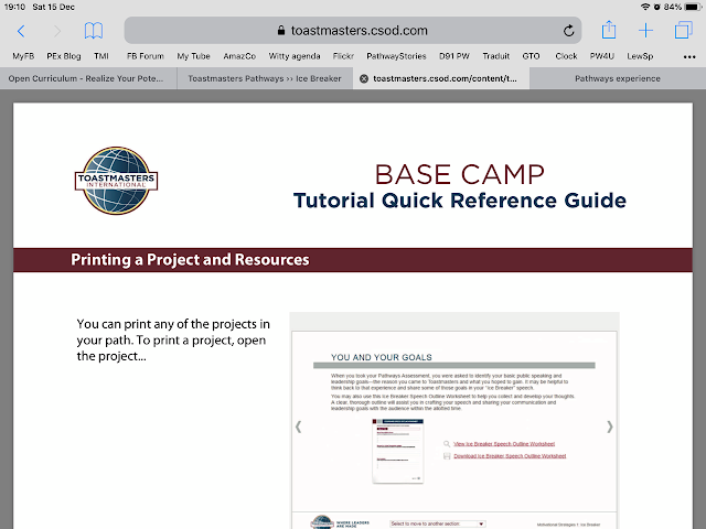
Your Assignment is one of the first pages in any project. Here I discovered a "Directions" and when clicked under it "Printing your Project" - download and print and then in Burgundy color, View Printing a Project and Resources.
Of course, clicked on it!
Jumped up the Base Camp Tutorial Quick Reference Guide's 4 pages to read one after other. Linked inside the Icebreaker page! How long did I dream to have similar features!
 That is how is shows on my iPad using all the space. In a tab, as I usually want it.
On my Macintosh, it arrived as a popup on middle of my page.
In both cases, the important is that for the first time, I have seen a Tutorial, indeed they are all short, clear and good, coming inside a Project, on a page where it was needed. Explaining things to newcomers.
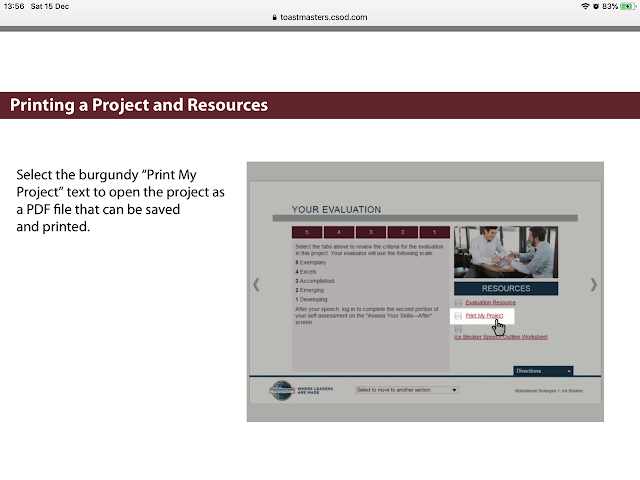
On next page, it explained how to jump to the Evaluation page where you find the Print and download the Project's Manual and Evaluation and other resources.
And at the end, showing the Your Evaluation page where we find the Print, through which we can also save.
All four pages coming up seamlessly and flowing from one to the other.
If it continues like this, explaining to each other will no more be needed or less and less. The only problem: why are we not told there is a new feature?
I discovered this in the Strategic Relationship's Icebreaker, but went back, opened some Icebreakers I already finished: it is there also now. It is almost so, now I begun doubting: is it really new or was always there?


No comments:
Post a Comment